4 great fonts to use right now
Rather than go on a rant about Comic Sans and Papayrus like the rest of the internet, I thought I’d share my recent font-favourites with you. It’s always good to celebrate rather than criticise, so here’s a rundown of what has caught my eye lately and why I’m using it. Read on for 5 great fonts to use right now.
Raleway
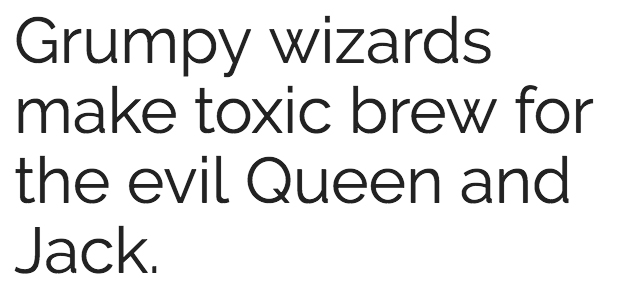
I first noticed this font on the ParknFly website, and fell in love with its crossed over W’s. It’s a simple sans serif, but has some personality in its lines. The e is very friendly, the tail on the Q is to the point and the spacing is just perfect.
I’ve used it across print and online, and its application is seamless no matter where you use it – logos, headings, callouts, body copy. It’s very versatile and clean, and has a nice roundness to the letters.
I’m currently using Raleway on this website, and as you can see it’s wonderful for online body text and headings. It’s included in Google Fonts, Adobe Typekit and as a free download from Font Squirrel.


Sanelma
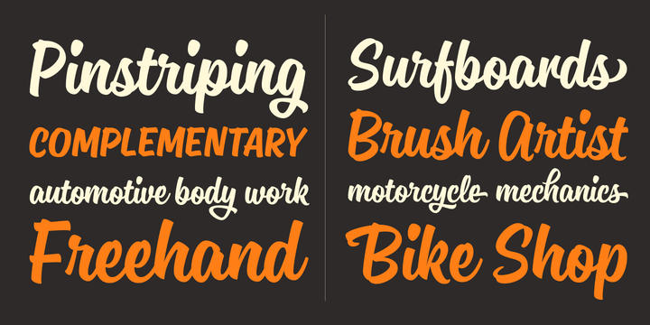
This is a gorgeous, versatile scripted font. Made with a brush pen and inspired by old school sign writing, you can literally type any word in this font and it just looks cool. It’s clean edges and seamless construction make it a pleasure to use, and it’s great for callouts and headings, remaining clear and readable no matter what word you throw at it.
I’ve used it in the logo design for t-shirty as it stands alone so well. There was no need for any additional logo graphics in this branding!
Sanelma is available to purchase from MyFonts.
Roboto
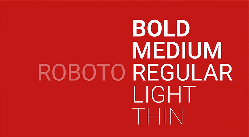
Roboto is another fabulous sans serif that’s great for websites and print. It’s construction is slightly condensed, but not so much that everything gets a ‘narrow’ look to it.
I find this font a little more masculine than others, and tend to use it for clients that have a predominantly male target market or are from a male-focussed industry. Visit the Plumbing Wise website to see it in-situ, it’s great for large amounts of body copy and the bold version really pulls the headings out of the page.
It also comes in a Slab, Mono and Condensed version, and it’s included in Google Fonts, Adobe Typekit and as a free download from Font Squirrel.


Revista
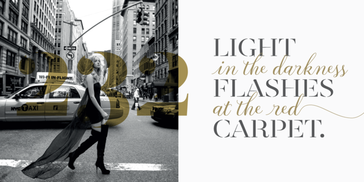
Revista was created with fashion magazines in mind, harmoniously blending different styles into a single big family. The family consists of an uppercase and small caps variant, an Inline Black variant, a stencil and a script, and looks fabulous when used in any combination.
It’s elegant, timeless and when using different variants in the one piece of artwork, gives the designer the ability to create a journey of words. Revista is available to purchase through MyFonts.
